Using the card creator
This quick guide contains the help previously available inside the app while the new searchable help centre is prepared.
Getting around
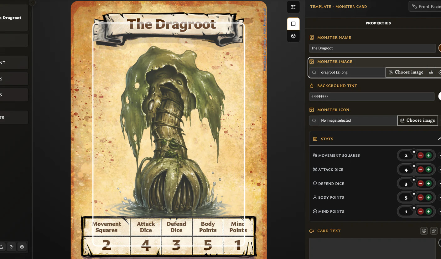
The editor is split into three main areas: actions and navigation, the live preview, and the inspector. The left navigation contains quick actions for Cards, Decks, Assets, Settings, and Help. The preview shows your card as you edit it, and the inspector on the right is where you change titles, rules text, stats, images, and template-specific options. Most changes update the preview instantly, so you can trust what you see.
Cards, Decks, and Assets open in the main area, and your editor preview is still there when you return.
You can switch appearance mode between Light, Dark, or System from Settings or the left navigation theme control.
Creating and editing cards
- Choose a template, such as a hero, monster, treasure, or card back, from the template picker or inspector. Each template matches the proportions and feel of the original cards.
- Use the inspector to edit the title, rules text, stats, and any template-specific settings.
- Drafts are saved automatically per template in your browser, so you can switch templates without losing in-progress work.
- Start a new card in draft mode or open an existing card, make changes, and save when you are ready.
- Title toolbar controls are template-dependent. Labelled backs can switch between ribbon and plain styles and use top or bottom placement.
Preview modes
- The preview toolbar lets you switch between the standard view and a 3D view.
- Use the standard view when you want to see the card exactly as it will print.
- Use the 3D view to see how the card would look if you held it in your hand and could turn or flip it.
- In 3D spin mode, double-click to recenter the card. If it is already front-facing, double-click to flip it.
Text, formatting, leader lines, and alignment
-
Rules text supports a simple markdown-style syntax. Bold uses
**double asterisks**, italic uses*single asterisks*, and bold plus italic uses***triple asterisks***. - Text wraps automatically inside the available area on the card.
-
For dotted leader lines, such as cost lines, wrap a line like
[cost [...] 1gp]. The dots are drawn between the label and value. -
To group leader lines and control their layout, wrap them in
[[and]]. Add an optional settings line such as[{pivot:50%, wrap:value}]to set a fixed pivot or wrap values inside the value column. - Inline dice tokens are supported in body text, including combat faces, D6 pips, CD/AD/DD/MD, and colour or face overrides.
-
Alignment directives let you switch alignment mid-text. Use
:::ac,:::al, or:::aron their own line, and use:::to reset. -
For a single aligned block, wrap text like
:::ar your text here:::. The block can span multiple lines. - On hero and monster cards, the body text grows upward from the bottom while the stats strip moves up to make space, mirroring how printed cards behave.
Text fitting and readability
- Use the Text Fitting button in the preview toolbar to adjust minimum font size and ellipsis rules.
- These settings affect titles and stat headings and are useful for long names or narrow stat labels.
- If text feels cramped, lower the minimum font size or enable ellipsis for cleaner truncation.
Working with images
- Open Assets to upload artwork into the shared image library in your browser.
- In the inspector, choose an image for the current card. The app scales it to fit within the artwork window by default.
- Use Image Adjustments to fine-tune scale, offset, and rotation. The step buttons let you nudge left, right, up, or down with precision.
- Scale starts at fit-to-frame (1.0), and you can scale from 0.5 to 2.0.
- Zoom multipliers are literal (1x, 2x, and 3x), and full-card coverage remains reachable when needed.
- Once you find good framing, it is easy to repeat it across similar cards.
- Image and Icon fields support autocomplete search, and the current asset stays pinned in the results.
- In Assets, the Resources menu provides quick links to artwork downloads and external helper tools, including custom GPT art and icon generators.
- For compatible opaque PNG assets, use Convert to JPEG to reduce the file size.
Saved cards and the stockpile
- Use New in the left navigation to start a new card with a template.
- Save creates a card from the current editor state. Save changes updates the active saved card.
- Open Cards to browse, search, and load saved cards.
- Use collections to organise cards without deleting them.
- Delete moves cards into Recently Deleted. Restore is available there, and permanent delete is only available in Recently Deleted.
- In manage mode, switch between grid and table view. Table headers remain visible while scrolling.
- When starting with an empty library, Cards onboarding can guide setup and provide direct Import library actions.
Collections (organising saved cards)
- In Cards, the Collections panel lets you switch between All cards, Unfiled, and named collections. On narrow screens, the panel appears as a drawer.
- Create a collection with New collection, then add cards using Add to collection. Multi-selection is supported.
- Removing a card from a collection does not delete it.
- Delete is safe: cards move to Recently Deleted so you can restore them if needed.
- Enable the optional Collections tree view to group folders, collapse or expand them, and use the Collapse all or Expand all controls.
- Drag cards onto collection leaves to add them. Multi-selection is supported.
Decks (organising playable card systems)
Open Decks from the left navigation to build and organise structured card decks. Decks are designed for larger HeroQuest projects where cards belong to playable systems rather than loose collections.
- The Decks workspace includes a deck grid for browsing and managing decks, a deck detail area for groups and sets, a source panel for adding cards, and details panels for metadata and deck actions.
- Decks can contain groups, sets, and front-face entries. Use them to organise treasure pools, encounter groups, spell schools, hero systems, and expansion content.
- Create, rename, duplicate, delete, search, and multi-select decks from the grid.
- Most deck editing uses drag and drop. Reorder groups, move sets between groups, reorder entries, create groups from insertion boundaries, and drag cards into sets.
- Entries support quantities for repeated encounters, weighted treasure distributions, rarity, and balanced card pools.
- Removing an entry from a set does not delete the underlying card. Recovery workflows help return paired cards to sets when needed.
- The inspector can show deck membership context so you can see where cards are used across larger projects.
PDF export
Deck PDF export creates a print-ready PDF using real paper sizes, deck order, and an optional front-and-back layout. Open Decks, choose a deck, and use PDF export to review the run before exporting.
- The export flow begins with a summary so you can see what is included before changing layout or bleed settings.
- Complete sets exports sets with entries, All sets includes every set, and Selected sets lets you choose exactly which sets to print.
- In scopes that include them, empty sets can export with placeholder fronts so the set still prints with its back face.
- Fronts only exports front pages. Front + back exports paired front and back pages.
- Duplex presets change how back pages are positioned for double-sided printing. Use the alignment test PDF before a larger print run to check scale, placement, and the best preset for your printer.
- Layout settings control paper size, orientation, run mode, duplex preset, and bleed source. Bleed settings control bleed, rounded corners, crop marks, and cut marks.
- Export Profiles save reusable combinations of PDF layout, bleed, and mark defaults so you can keep different print setups ready.
- Manage Export Profiles from Export Settings, where you can create profiles and mark one as the default.
- In Deck PDF export, choose a profile for the current run before deciding whether to keep its defaults or customise the run.
- Customise layout and Customise bleed settings are per-run overrides. They do not replace the saved profile.
- Large exports can take time. The app shows progress and lets you cancel the run.
Card faces and pairing
- Some templates support front and back faces. Use the face picker to switch sides while editing.
- Pairing keeps connected faces together for browsing and export workflows.
- The inspector has Properties and Pairing views. Fronts can be paired with multiple backs, and backs can manage multiple fronts in one place. Deck set workflows can reuse these relationships.
- The pairing window supports multi-selection. Actions that remove several pairings show a confirmation prompt.
Title visibility and borders
- Labelled backs can optionally hide or show the title.
- Labelled backs can switch between ribbon and plain title styles, adjust placement, and set a custom title colour with reset.
- Some templates allow custom border colours, smart swatch suggestions, and saved swatches for quick reuse.
- Small and Large Artwork templates support textured border colour controls.
Exporting cards and backups
- Export the current card as a 750×1050 PNG from the inspector. It is generated from the same card render used in the preview.
- If a card has paired faces, the export menu can include both faces or an active front with a back.
- In Cards, use Export to export several cards together as a ZIP.
- Export options support print-oriented settings such as bleed, crop marks, and cut marks.
- Rounded-corner export behaviour can change with the selected print and export options.
- In Decks, export actions prepare structured deck content from the same workspace.
- When exporting a collection or selection, you may be prompted to include paired faces.
- If missing artwork is detected, you are prompted before export. Bulk export skips affected cards and includes them in a report.
- Missing-artwork warnings can appear in the preview, and a startup banner may appear if your library has missing assets.
- Deck export supports structured deck organisation and export preparation alongside print and PDF workflows.
-
Use Export data and Import data to back up or restore your entire library as an
.hqccfile. Import replaces existing data in the current browser profile, so export first if you want a safety copy. -
Library backup defaults to the compact
.hqccformat, while older backup imports remain supported.
Bulk export (downloading lots of cards)
- Export exactly what you can see: a complete collection, a filtered view, or a multi-selection.
- Bulk export creates a single ZIP containing the selected card images.
- Finalizing shows progress. If detailed progress is unavailable, you see a Finalizing status.
Tips
- If the interactive preview feels slow, use the standard preview until you need the 3D view again.
- Use text fitting controls to keep long titles and stat headings readable without shrinking everything.
-
Keep an occasional
.hqccbackup if you do a lot of card work in one browser profile. - Recently Deleted is a safety net. Restore cards removed by mistake.
- Fix missing-artwork warnings before export to avoid skipped cards.