Understand the Card Editing View
The Card Editor brings together a live view of your card and the fields used to change it. Use it to enter the card's content, check how everything fits, adjust its artwork, and preview how the finished card might look in your hand.
What am I seeing?
The large card area shows the card you are currently editing.
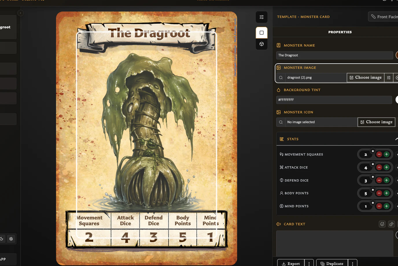
- When you start from a new template, it shows that template's default layout and any empty areas waiting for content.
- When you open a saved card, it shows its current title, artwork, text, statistics, colours, and other saved details.
- As you change a field, the card updates immediately. You do not need to save before checking the result.
The Properties panel beside the card contains the fields supported by the chosen template. Its status tells you whether the card is a new draft, a saved card, or has unsaved changes. Save becomes available when there is a valid change to store.
Standard preview
Standard is the main working view. It shows the card clearly while you enter content and make precise adjustments.
You can also click parts of the card to move directly to their matching field in the Properties panel. For example, clicking the title selects the title field. The same direct selection can be available for text, statistics, colours, and other editable parts supported by the template.
Clicking the artwork selects the image and displays controls over the card for moving, scaling, and rotating it. The Properties panel also provides image toolbar controls for choosing artwork, adjusting position, centring, automatic scaling, rotation, and lower clipping where the template supports it. See Add and Position Artwork for the full artwork guide.
When selected Hero or Monster artwork has a lower clip enabled, the Standard preview can show a horizontal guide and a faint view of the clipped-away artwork. These guides help editing only; they are not part of the exported card.
Some card parts have a useful double-click action. For example, double-clicking an image can open the image chooser so you can replace it.
Interactive preview
Interactive lets you examine the card more like a physical object. Use it to check the overall impression, surface, lighting, and how the card reads when it is tilted or turned. Return to Standard when you want to select card parts or make precise edits.
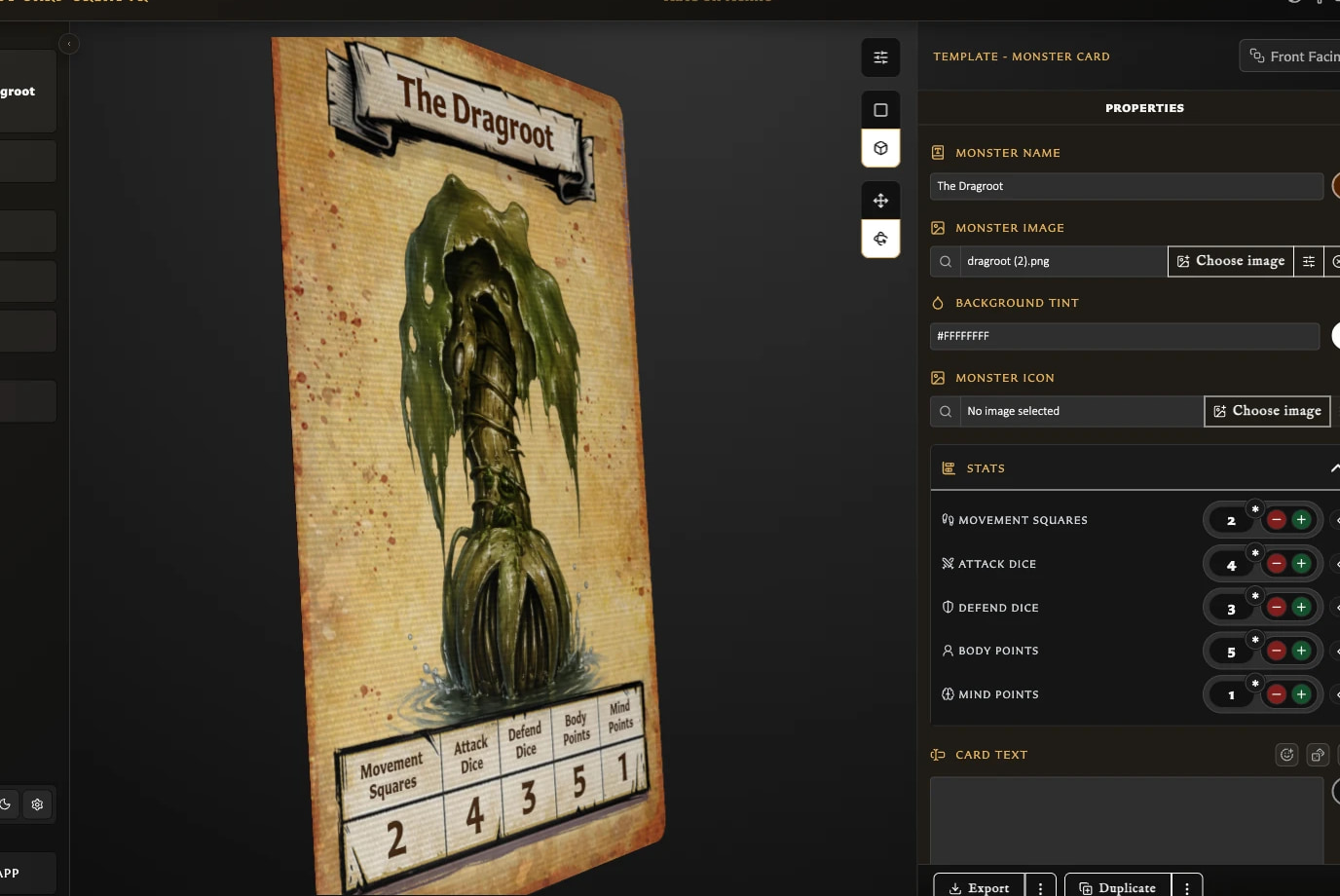
Interactive preview has two ways to move the card:
- Pan gives the card a limited tilt as you move across it. Releasing it returns the card to the centre. This is useful for a quick physical-card impression.
- Rotate lets you turn the card fully and leave it at the chosen angle. This is useful for inspecting the edges and reverse face.
When the card has an opposite face paired with it, the reverse side uses that card. If it has not yet been paired, the reverse indicates that it is Not Yet Paired. Double-clicking while the front is facing you flips to the reverse; double-clicking from another angle returns the card to the centre.
What can I change in Properties?
The fields depend on the template. A Hero card, Monster card, artwork card, Rules card, and card back each have different needs, so you will see only the relevant controls.
For a template-by-template comparison and the less obvious stat, colour, icon, copyright, logo, and back-text controls, see Understand Template-Specific Card Controls.
| Field | What it is for |
|---|---|
| Name, title, or label | Sets the main identifying text. Title-bearing cards can keep name and title linked or show a separate library name above the printed title. Some back templates can hide the title or change its position, colour, ribbon style, and typography. |
| Image | Chooses reusable artwork from Assets and controls its position, scale, rotation, and lower clipping where supported. |
| Stats | Sets values such as Attack, Defend, Body, and Mind on templates that use statistics. |
| Card, rules, or back text | Holds the main written content and offers the text helpers supported by that template. |
| Background tint | Changes the colour treatment behind the card content and can offer blend-mode choices. |
| Border colour | Changes the outer border on templates that provide a configurable border. |
| Monster icon | Chooses the icon used by a Monster card. |
| Hero Back logo | Chooses or changes the logo used on supported back templates. |
| Copyright | Controls the small copyright text shown on the card. |
Saved cards can also show Pairing, Collections, and Decks tabs. These describe or manage how the current card relates to other saved work. Actions at the bottom of the panel can include Export, Duplicate, and Save.
See Understand the Pairing Tab for the front- and back-facing relationship views and Pair and Unpair Card Faces for the management steps and safety warnings.
Body-text tools
The main text box is where you write the card's description, rules, or back text. Your changes appear on the card as you type.
Depending on the template, tools beside the text box can include:
- Emoji opens a picker and inserts an emoji at the current cursor position or replaces the selected text.
- Inline dice builds a dice symbol without requiring you to remember its code. You can choose a standard six-sided die, icon die, or detail die; select its face or value; choose colours; reuse recent choices; preview the result; and insert or copy it.
- Formatting help shows examples for bold, italic, underline, colour, size, titles, subtitles, alignment, leader lines, grouped leaders, and inline dice.
- Text colour changes the main body-text colour where the template supports it.
- Backdrop controls can show or hide the panel behind the text, place it inset or flush with the card, change which title corners it meets, fit it to the text or use the full available area, and change its colour.
- Show or hide body text lets supported back templates keep their text area optional.
- Scale to fit body text reduces body text when necessary so that it remains inside a fixed text area. The setting belongs to the current card.
See Format Card Text for the available formatting patterns and examples.
Why do the text options vary?
Each template has its own layout. Some provide a fixed panel for body text, while others arrange the text as part of a more flexible card design. The editor only shows controls that make sense for the current template.
For example, artwork, Rules, and supported back templates can provide Scale to fit body text because their text must stay inside a fixed area. Hero and Monster cards arrange their descriptions differently, so that per-card toggle is not shown there. Backdrop and title-layout controls appear only on templates designed to use them.
Text fitting settings
Text fitting settings in the preview toolbar is separate from body-text fitting. It changes the app-wide rules used to keep titles and stat headings readable, including their minimum text sizes and whether overflowing text may end with an ellipsis.
Use the body-text toolbar when you want to fit the current card's main text. Use Text fitting settings when you want to change how titles and stat headings behave across the app.